A Loofah for New Lexus Hybrid
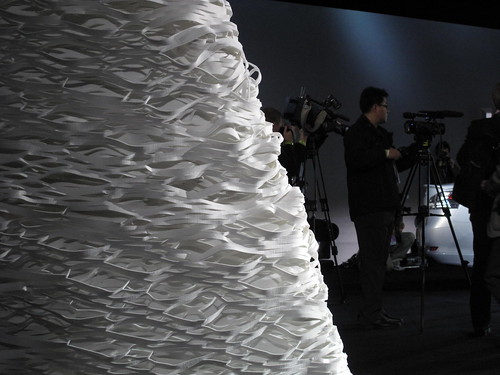
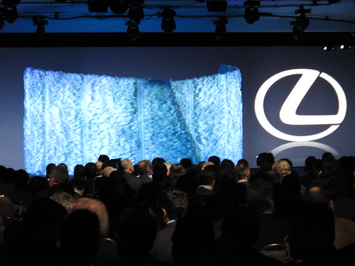
I actually love this. I certainly wasn't thinking "loofah" when I designed this surface, but it works. [I certainly wasn't thinking "birthday cake." That offends me a little, but I'll get over it.] The design intent was to compliment the work Nendo did for Lexus.


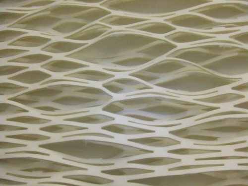
The thing about this set is we got to recycle it from the LA auto show. Normally set pieces are thrown into the dumpster after a press event - which is a freaking disgusting practice, but out of our control. Our design agency, o2 has been very diligent about reusing architectural elements and Toyota/Lexus has been very receptive. I wasn't thrilled with how the scenic company who built it applied the expanded felt - it was supposed to be much more structural and cellular, as seen in the prototypes. Nonetheless, the surface material of the set got more interest than the car - which is... interesting.
I'll post later about the Prius 3 launch we did, which had zero architecture and zero waste.
Monday, January 19, 2009
The New York Times says my set design for Lexus looks like a loofah
Posted by:
Unknown
at
1/19/2009 03:48:00 AM
![]()
Subscribe to:
Post Comments (Atom)

No comments:
Post a Comment