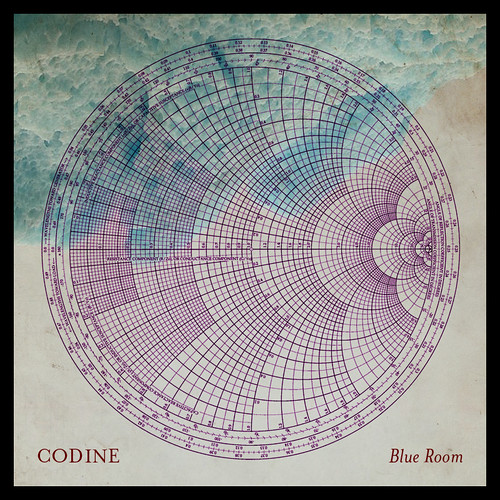
Blue Room is the upcoming sophomore release from Codine on the excellent Blank Artists label and second one I've had the pleasure of designing for him.
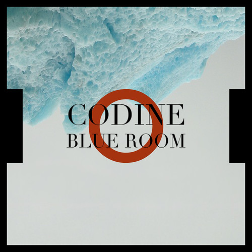
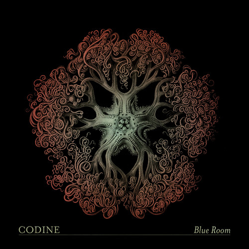
The inverted iceberg is from a photo Erik [Codine] took in Argentina last year and the diagram is a Smith chart. Below are a couple of runner-up designs.

Friday, July 11, 2008
Codine: Blue Room
Posted by:
Unknown
at
7/11/2008 08:44:00 AM
![]()
Subscribe to:
Post Comments (Atom)

5 comments:
Bout time Erik.
Love it!
nice, nice! diggin the iceberg and smith chart.
They are all great, but the iceberg cover is particularly striking. I don't know what font that is, but it's a great choice.
"They are all great, but the iceberg cover is particularly striking. I don't know what font that is, but it's a great choice."
Thanks! That layout is a combined homage to Front 242's Tyranny For You era icons and New Order's Substance.
The font is Didot, which is used for CBS's "eye" logo, and as best I can tell, on the aforementioned Substance and recently on Telefon Tel Aviv's Remixes Compiled. I previously used it for Solvent's Radio Ga Ga EPs [per Mr. Valenti's suggestion] which was itself an homage to Section 25's Always Now.
The font on the final version is Mrs. Eaves by Emigre. Both fonts are so nice, even the most hack designer can look good using them. ;)
Post a Comment