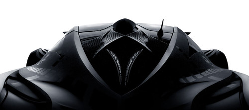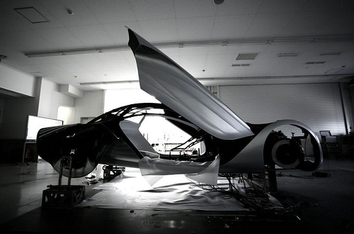
There's a good article over at Car Body Design on Mazda's bold new design language.
“We wanted to create cars that had a ‘snapshot feeling’ of this natural motion,” explains Laurens van den Acker. “We realised that the automotive industry is one of the few industries that hadn’t yet captured these amazing natural textures from the landscape. Architecture, fashion and product design have all looked at these landscape elements. There was a great opportunity for us to interpret this for Mazda design.”
“Our new surface language is car-centric,” adds Franz von Holzhausen. “After studying the architectural approach, which tends to be strictly rigid, and the organic approach, which is highly fluid, we created Nagare to straddle those two disciplines. It is fluid, graceful, and dynamic. But the message it registers on the beholder is flow-motion.”
From here Mazda’s designers began to explore the possibility of textured surfacing on cars: as if the cars’ surfaces had been naturally sculptured by air or water. Mazda’s design team began by developing a surface language to visually describe their Flow philosophy. Like the natural elements that had inspired them the team wanted to communicate the sheer raw power of Mazda motion even when their cars were still, as van den Acker explains:
“It was in making the transition from observing motion in nature as an expression of energy to applying it to a manmade object such as a car that we discovered what a thoroughly exciting and logical creative approach the design concept represented. This revelation allowed us to proceed to create one dramatic and unique design after another.”
Conventional automotive design dictates that the panels of car bodies are comprised of smooth, clean and clear surfaces. Yet Flow is like a ripple or a wave effect across the surface of the metal.
“The surface language of Nagare goes against conventional design thinking of clean, uncomplicated surfaces,” explains Franz von Holzhausen. “This is what we are all taught at college so it goes against the grain.
“We are breaking the golden rule of design – which is to simplify,” explains Laurens van den Acker. “Everybody will tell you to remove lines until you have no more left to remove. We are adding lines, which is kind of counter intuitive, but if we do it well it looks natural and creates beauty.”
Previously on Burnlab: Crossed Folds and Maximum Joy
Sunday, June 01, 2008
Mazda's Nagare Design Language
Posted by:
Unknown
at
6/01/2008 10:15:00 PM
![]()
Subscribe to:
Post Comments (Atom)

No comments:
Post a Comment